A decadeleading digitalend to end.

For organizations that are regulated and brands that are luxury. Strategy, design, copy, campaigns, and the numbers behind them.

Scroll

Usually leading a team or agency partners, often with my own hands on the work.

Selected work


01

Turning an abandoned website into a fundraising platform

Nonprofit, digital fundraising

Decades of community trust, and a site that could not take a donation. Strategy, a rebuilt giving experience, and a new role for digital inside the organization.

Read the case study
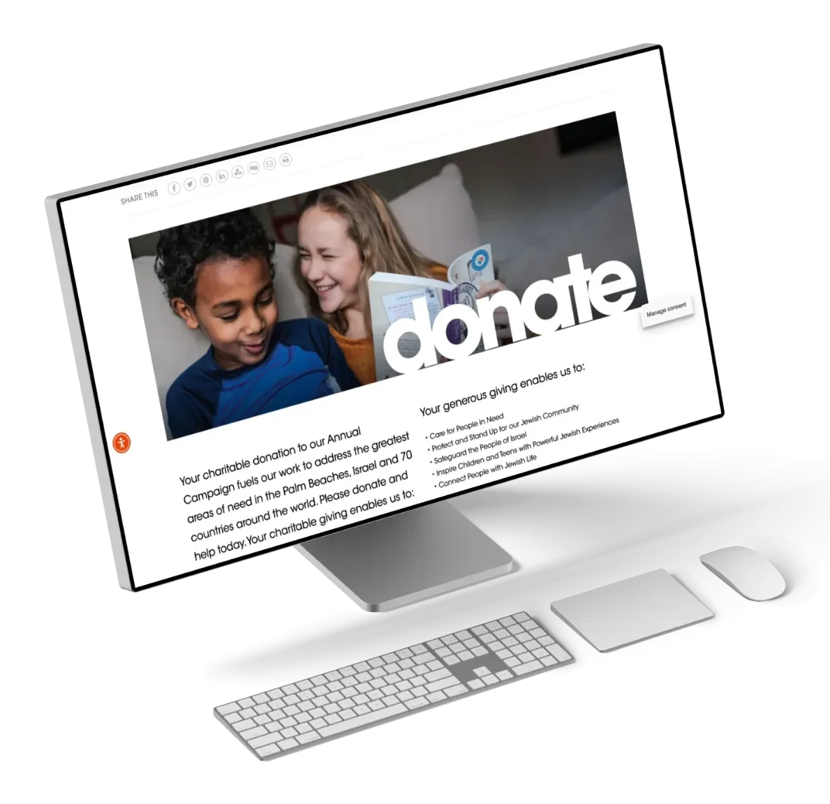
  • The original donate page on a desktop: a row of eight share icons above a banner image, then paragraphs of text.

    Before

  • Eight ways to share it

    The donate page opened with a share row.
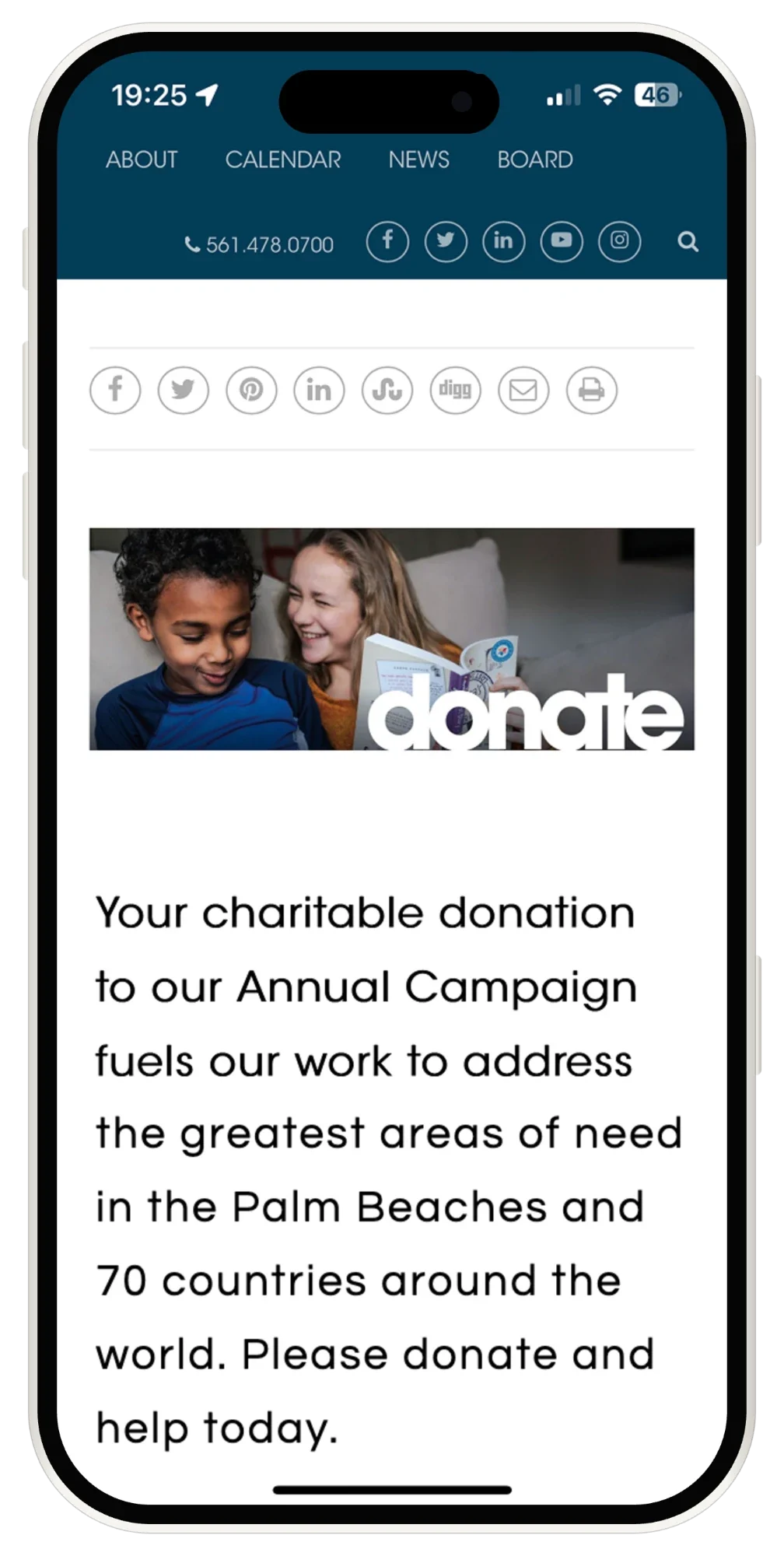
  • The original donate page on a phone: navigation, a phone number, five social icons and a search, then eight share icons, before any content.

    Before, on a phone

  • Nineteen taps first

    Controls between the top of the screen and the first sentence.
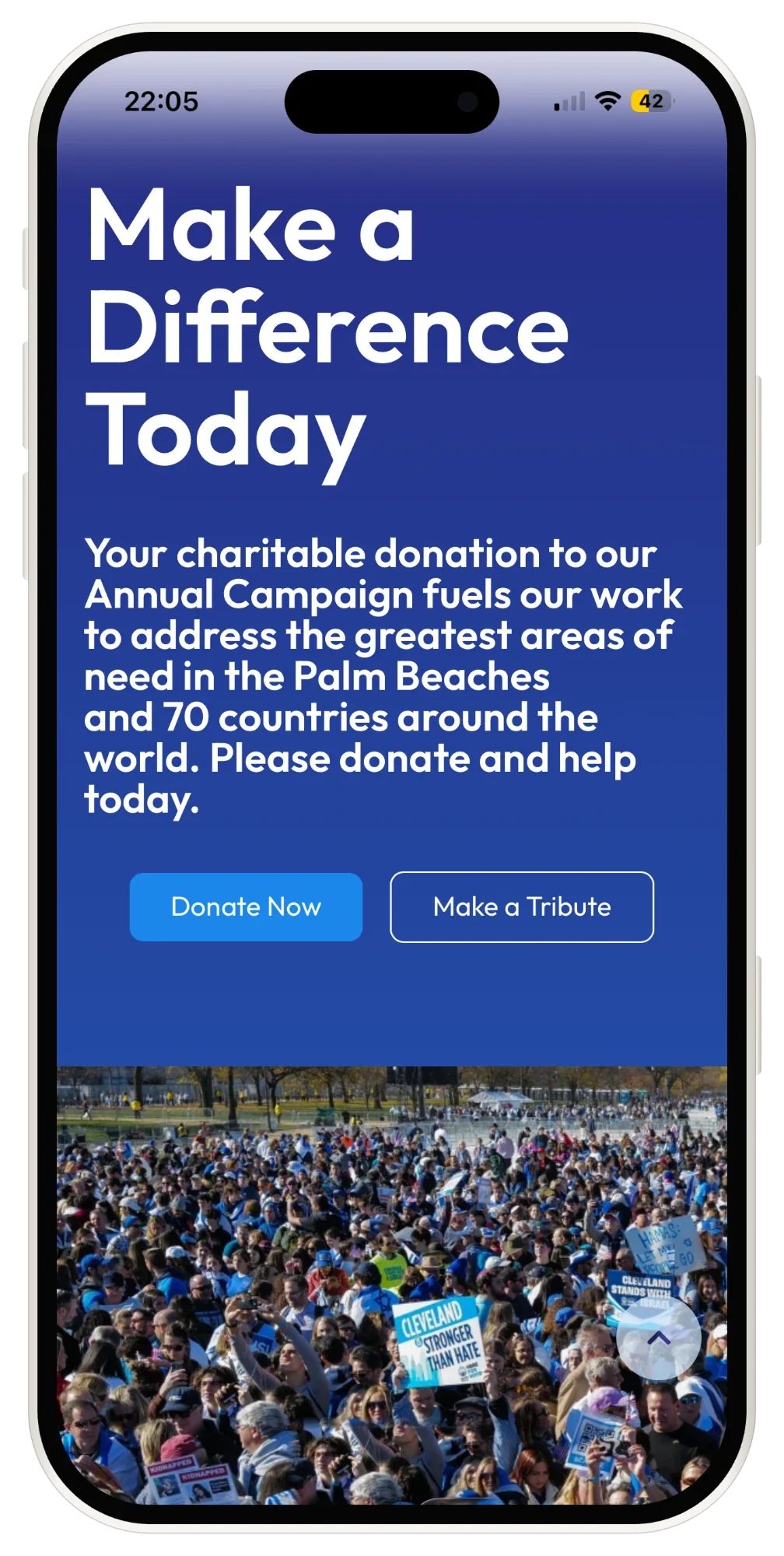
  • The rebuilt donate page on a phone, headlined Make a Difference Today above Donate Now and Make a Tribute.

    After

  • Two buttons

    Donate now, or make a tribute.
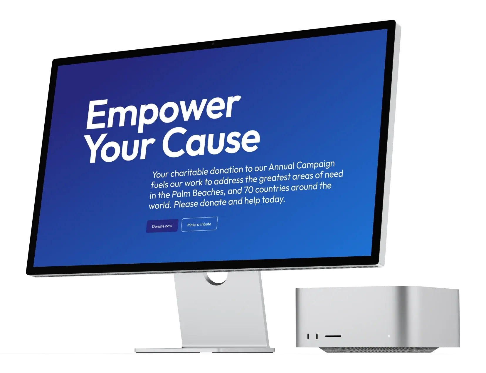
  • The rebuilt giving page on a desktop display, headlined Empower Your Cause above two buttons.

    After, on desktop

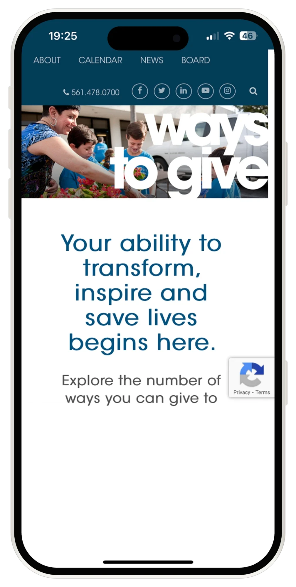
  • The original Ways to Give page on a phone: a banner, a heading, and body copy with no call to action in view.

    Ways to give, before

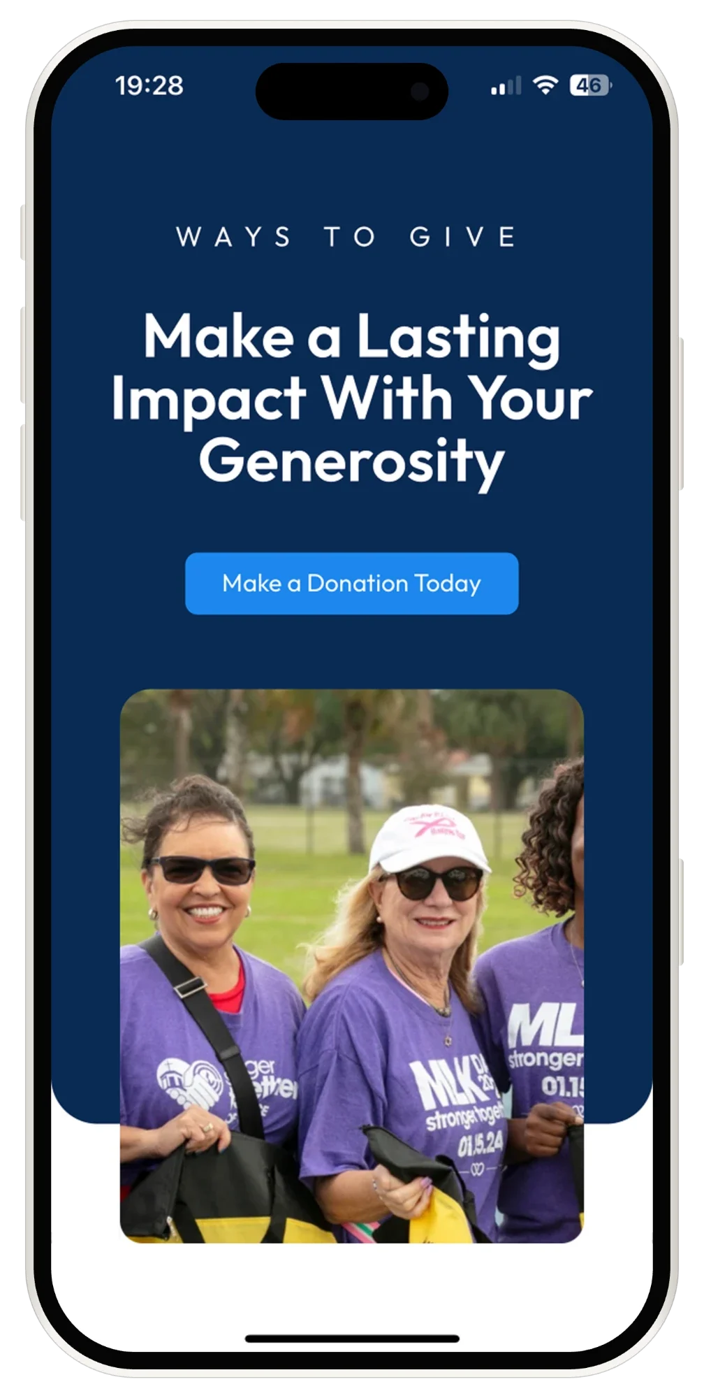
  • The rebuilt Ways to Give page on a phone, headlined Make a Lasting Impact With Your Generosity above a single donation button.

    Ways to give, after

  • +34% online giving

    And mobile use up 27% over the year.
02

Making a concierge's website act like a concierge

Luxury travel, strategy to design

A beautiful site that never asked. An audit, a new voice, and a clear journey from curiosity to inquiry, end to end and live.

Read the case study
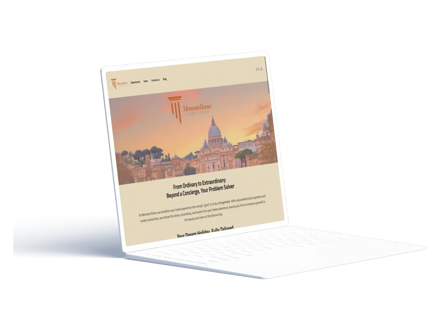
  • The original site on a laptop: centred paragraphs, no call to action.

    Before

  • 01 Audit

    Page by page, desktop and mobile.

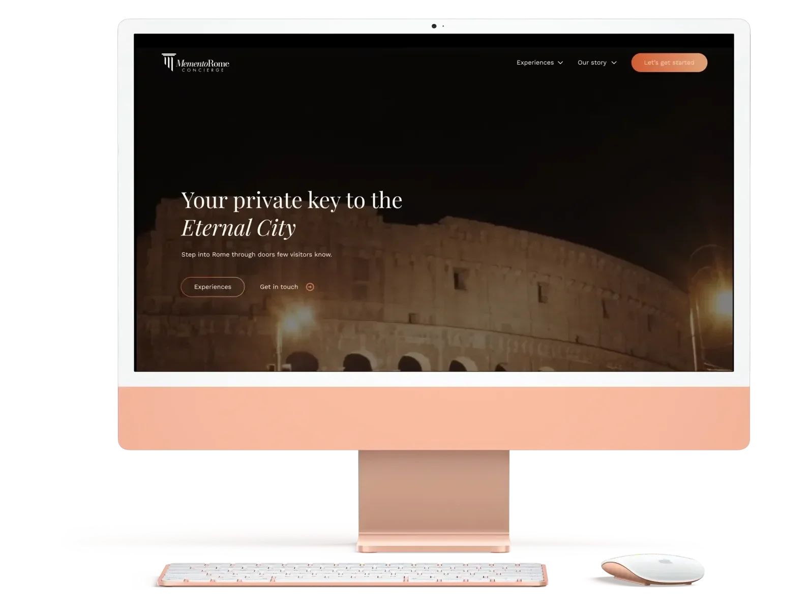
  • The redesigned Memento Rome homepage on a desktop: Your private key to the Eternal City over the Colosseum at night.

    The redesign, desktop

  • 02 Strategy and copy

    Your private key to the Eternal City.

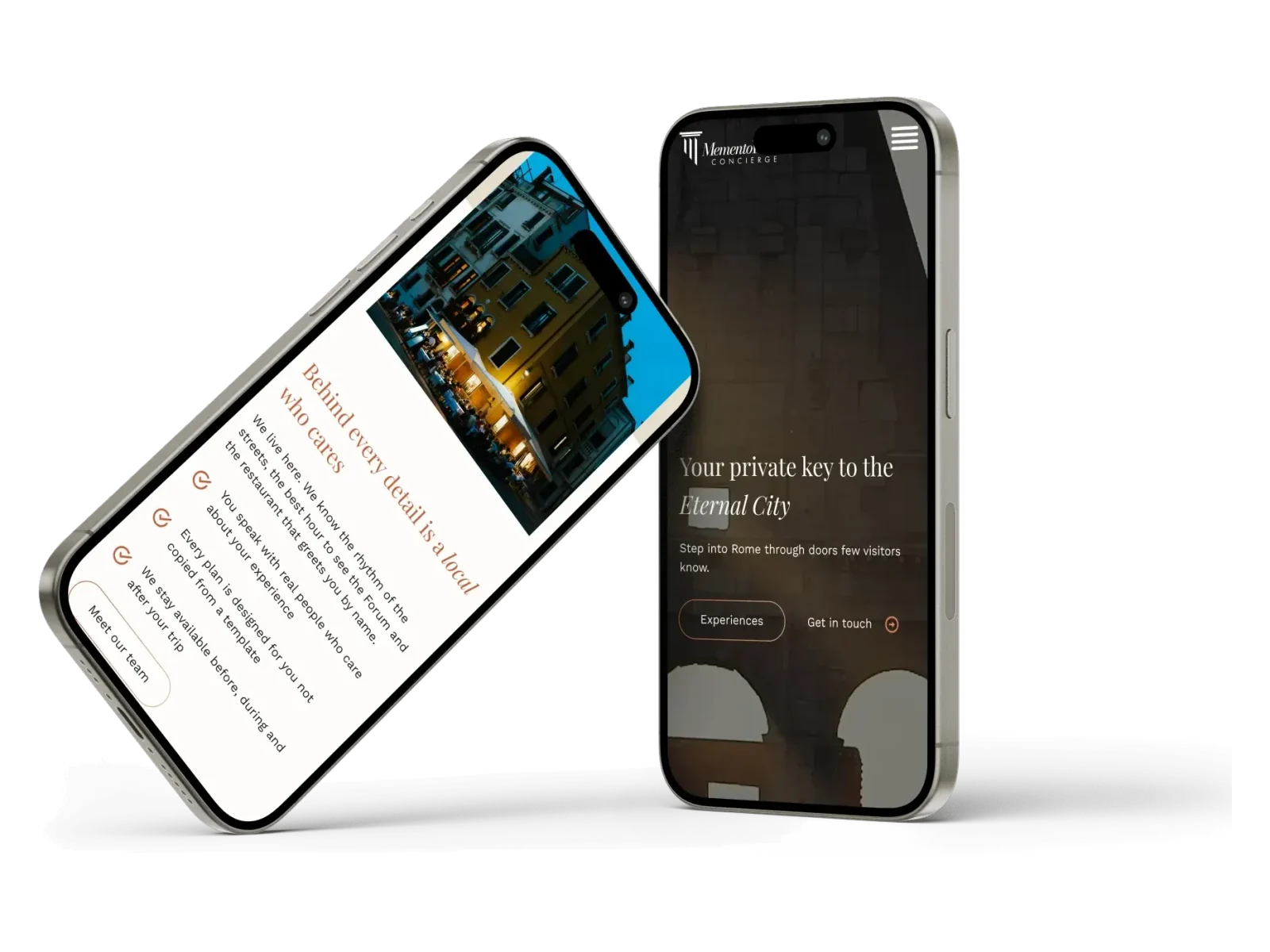
  • The redesign on two phones: the dark hero, and the locals section.

    On a phone

  • 03 Design

    A warm editorial system, handed to the client's developer.

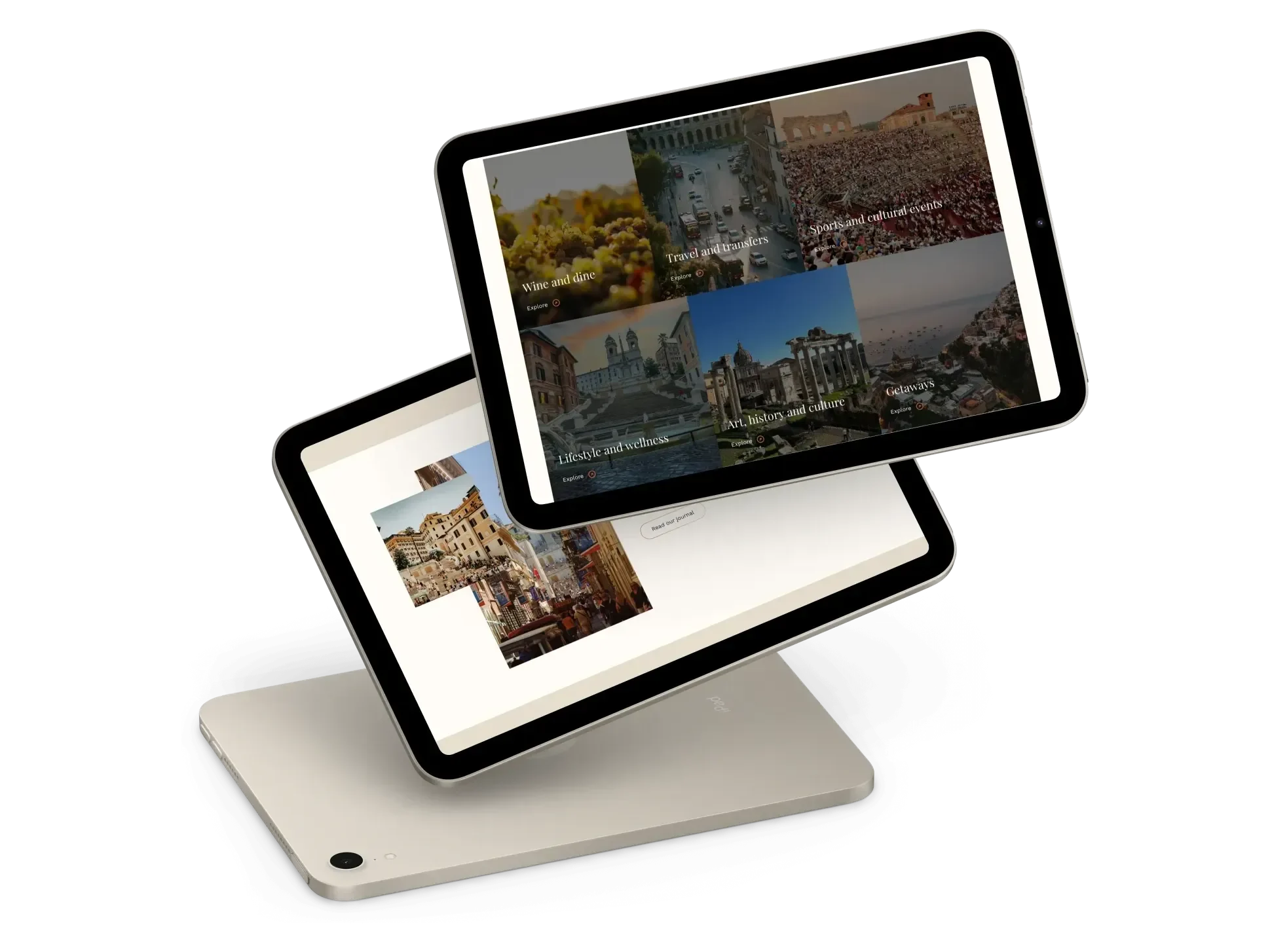
  • Two tablets showing the experiences grid.

    The experiences grid

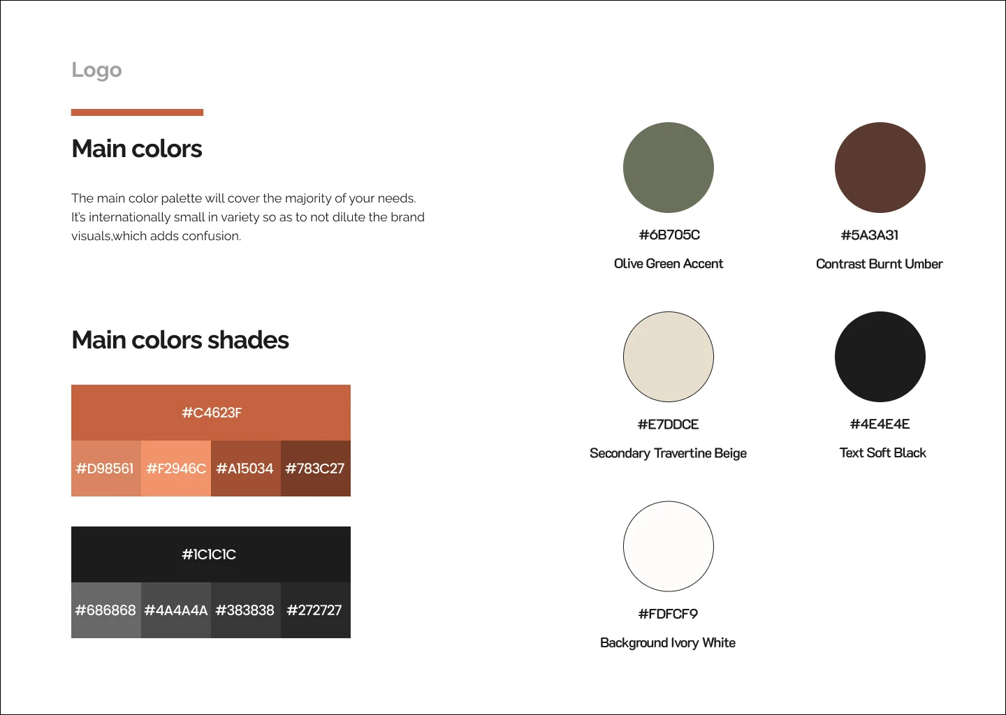
  • Style guide page showing the main palette.

    From the style guide

03

Launching a clinical-grade oral care brand in Gen Z's language

Consumer, brand and e-commerce

A dentist's idea built from zero: identity, packaging, e-commerce, and the campaigns that launched it.

Read the case study
  • Built from zero

    No brand, no products, no store. Just credibility.

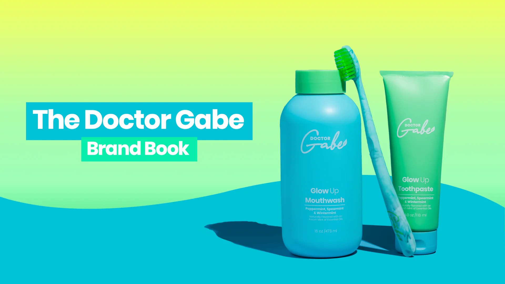
  • A spread from the Doctor Gabe brand book.

    The brand

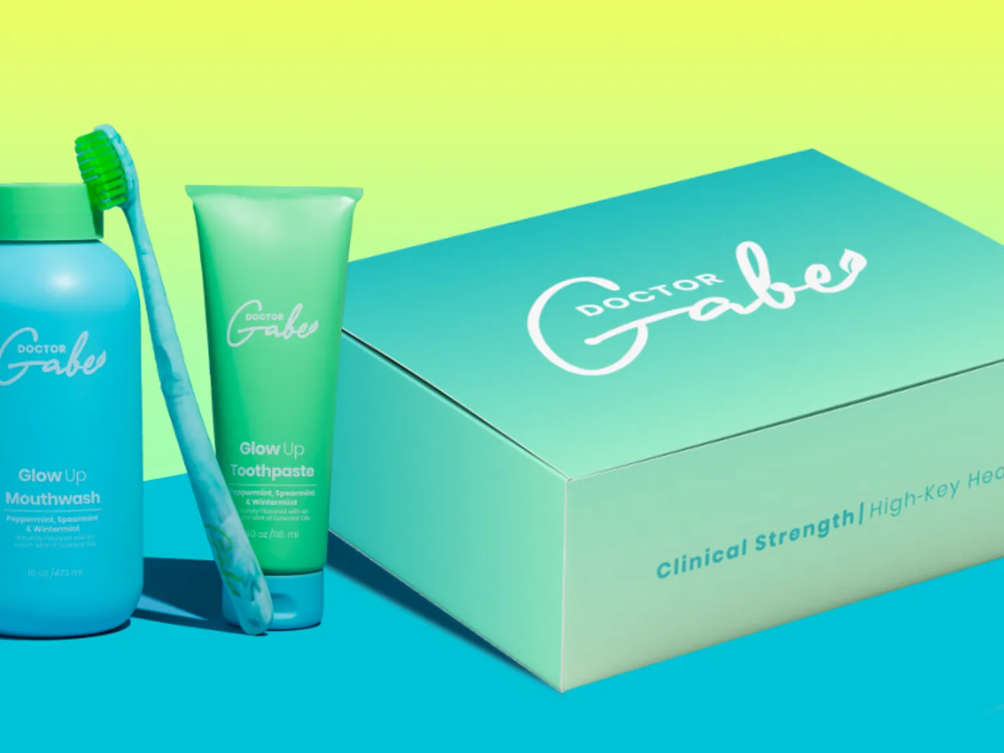
  • Doctor Gabe packaging: mouthwash, toothpaste and a brush beside a printed mailer box.

    The packaging

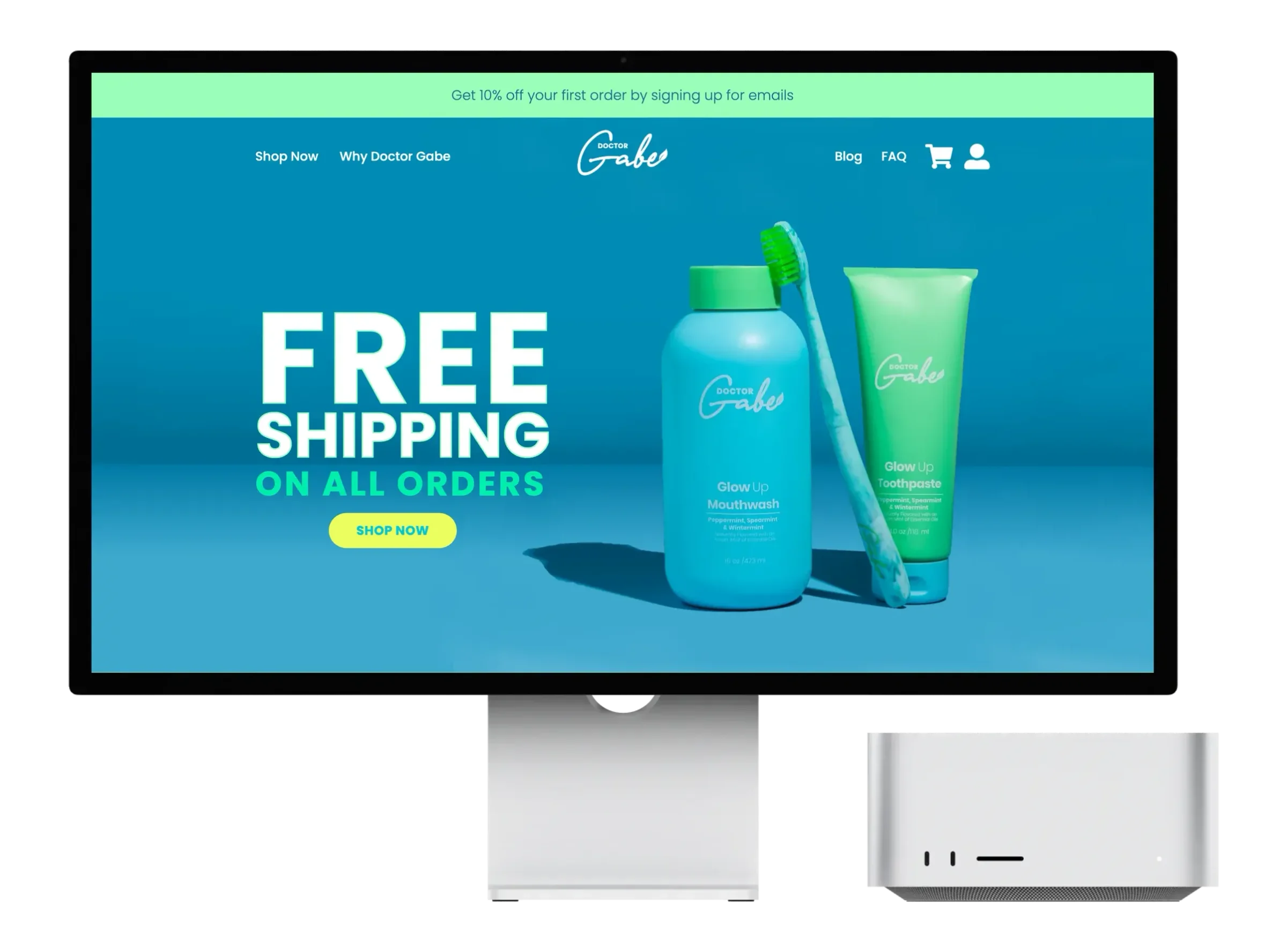
  • The Doctor Gabe store on a desktop display, headlined Free Shipping On All Orders beside the mouthwash, brush and toothpaste.

    The store

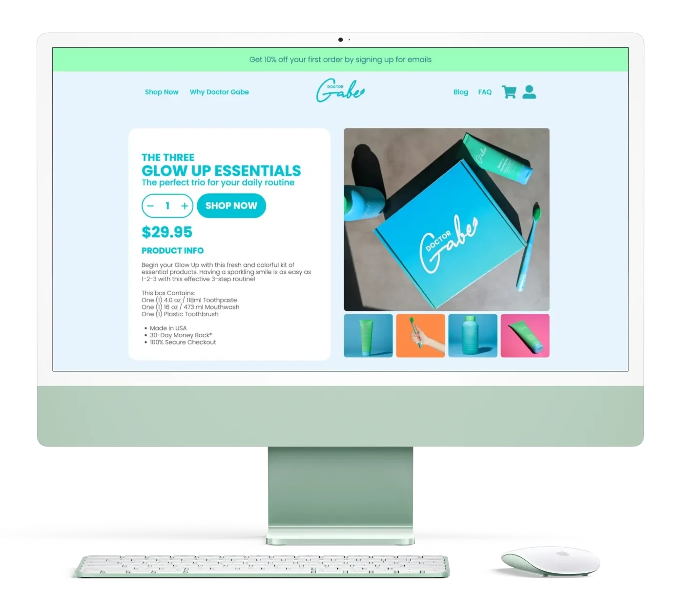
  • The Glow Up Essentials product page: the three-item kit with its price, quantity stepper and Shop Now button.

    The product page

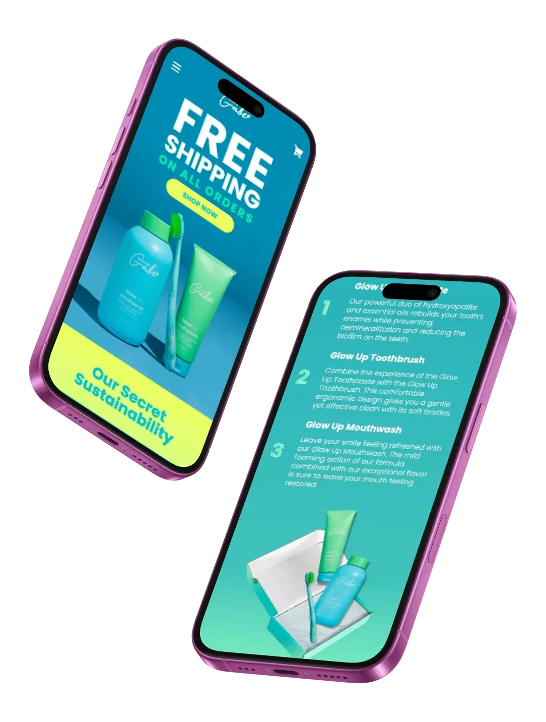
  • The store on two phones: a free shipping banner over the products, and the three-step essentials.

    On a phone

  • Identity, packaging, store

    And the campaigns that launched it.

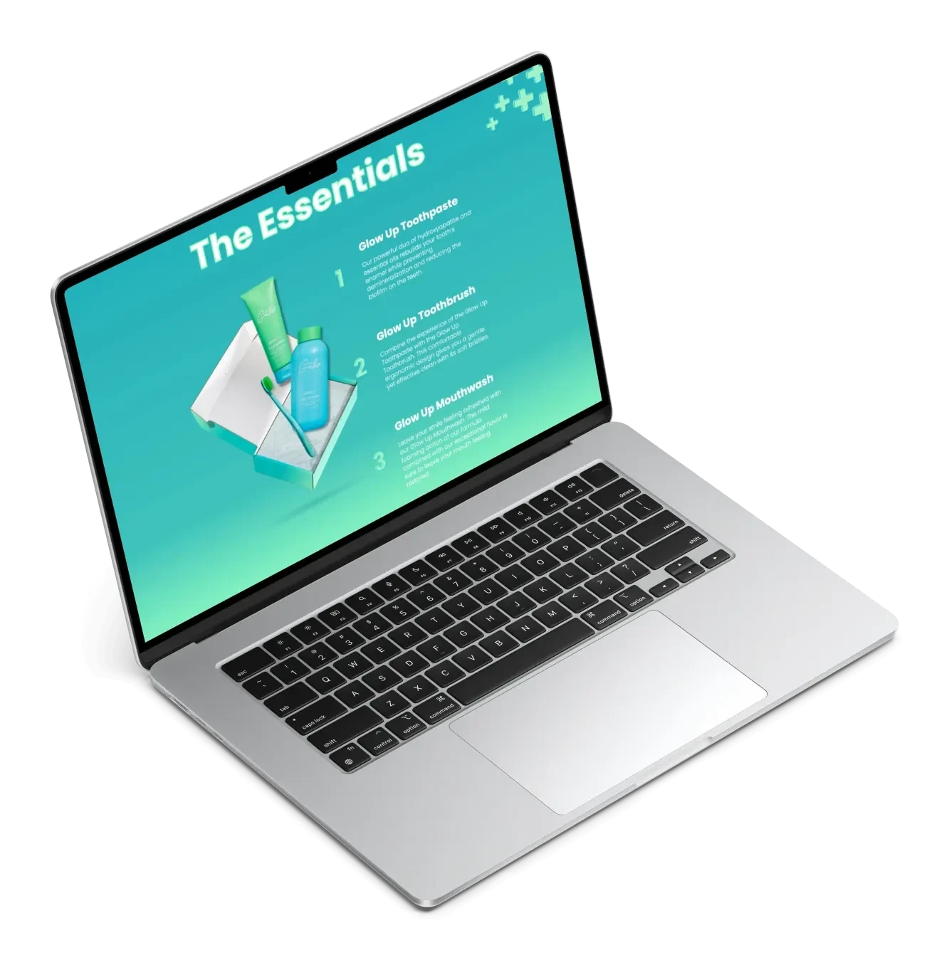
  • The Essentials page explaining the toothpaste, toothbrush and mouthwash in three numbered steps.

    Three steps

  • The founder's own network

    Direct lines to some of Gen Z's biggest creator audiences.

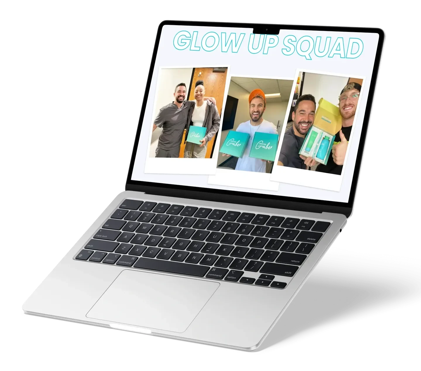
  • The Glow Up Squad page: polaroid photographs of creators holding the Doctor Gabe box.

    The Glow Up Squad

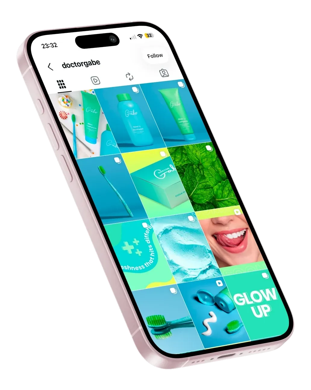
  • The Doctor Gabe Instagram grid on a phone: product, ingredient and lifestyle posts in the brand's mint and cyan.

    Social

04

Making a promising cancer therapy feel human

Biotech, brand and digital

Eight months to warm a cold clinical brand ahead of Phase 3 trials, with every word cleared through review.

Read the case study
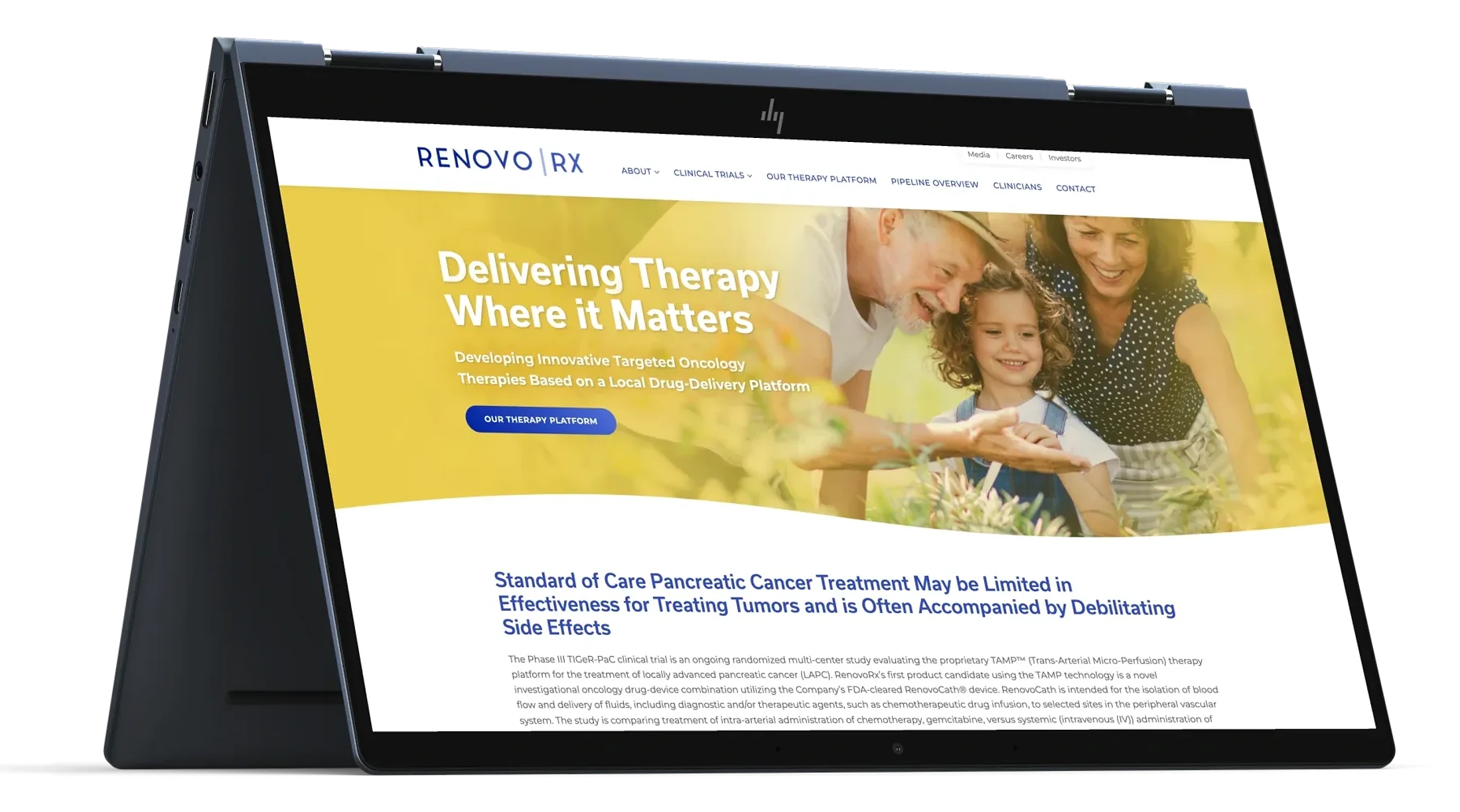
  • The RenovoRx homepage on a laptop: the line Delivering Therapy Where it Matters over warm family imagery.

    The site

  • Warming a clinical brand

    Eight months, ahead of Phase 3 trials.

  • The RenovoRx wordmark: RENOVO beside RX, divided by a rule.

    The mark

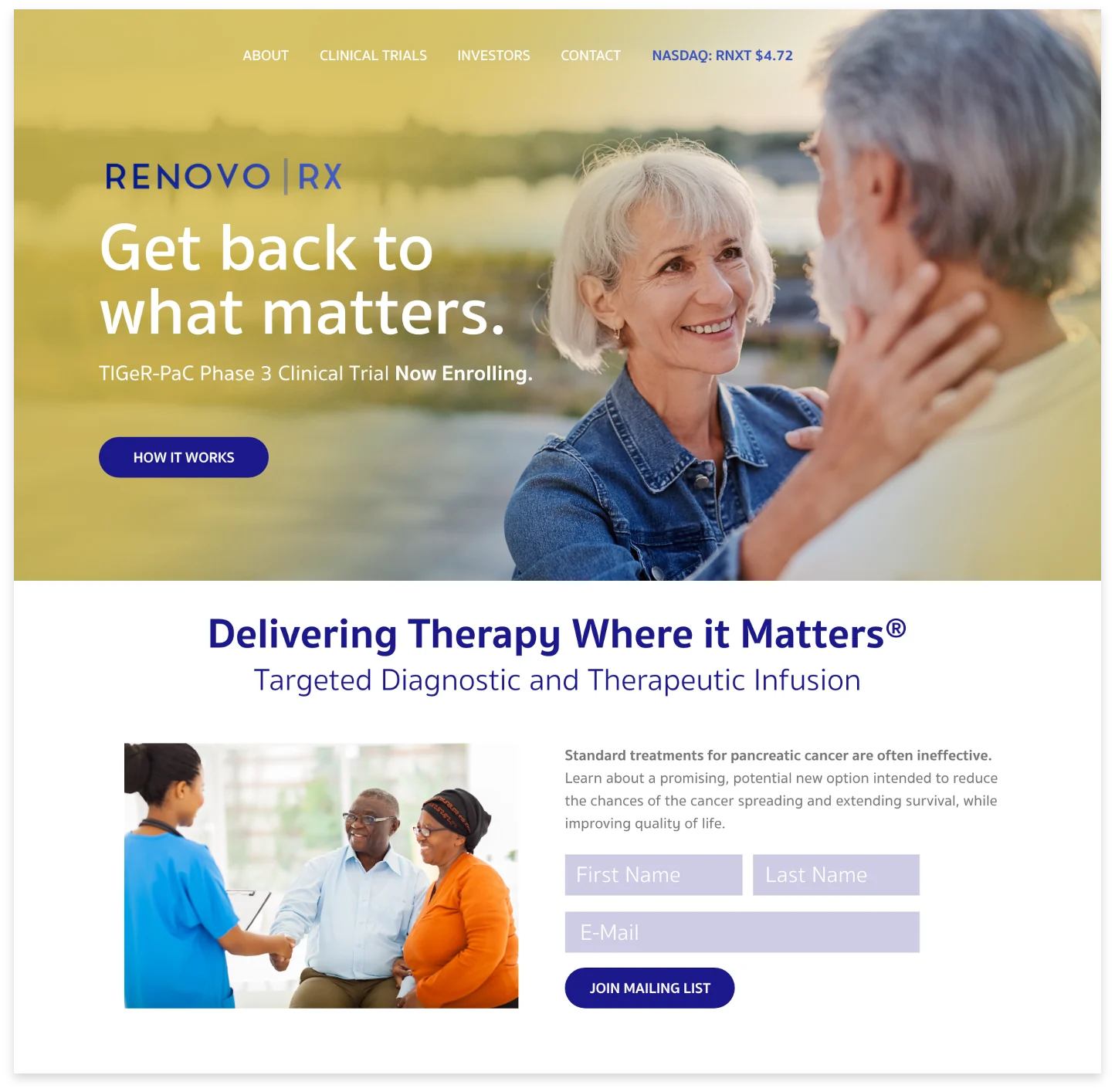
  • The redesigned RenovoRx site: warm family imagery over the line Delivering Therapy Where it Matters.

    Clinical pages, made warm

  • Every word cleared

    Through a regulatory review board.

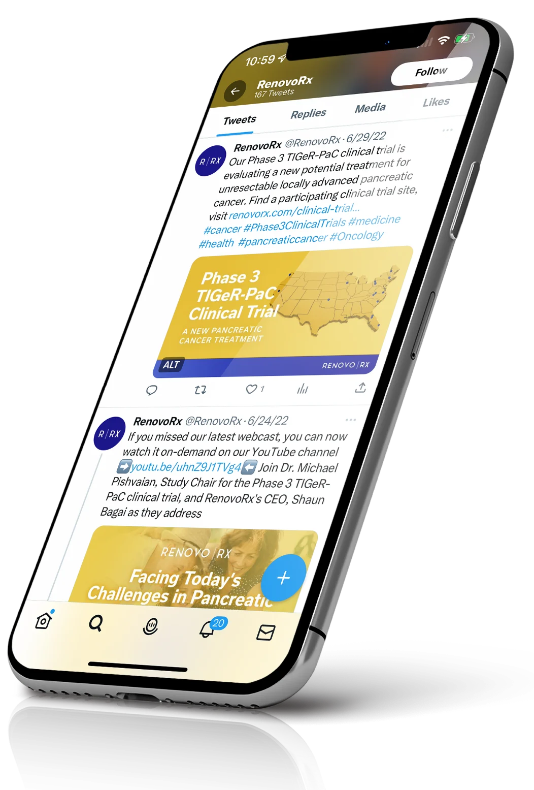
  • The RenovoRx social feed on a phone: trial updates and webcast invitations over the brand's deep blue.

    Social presence

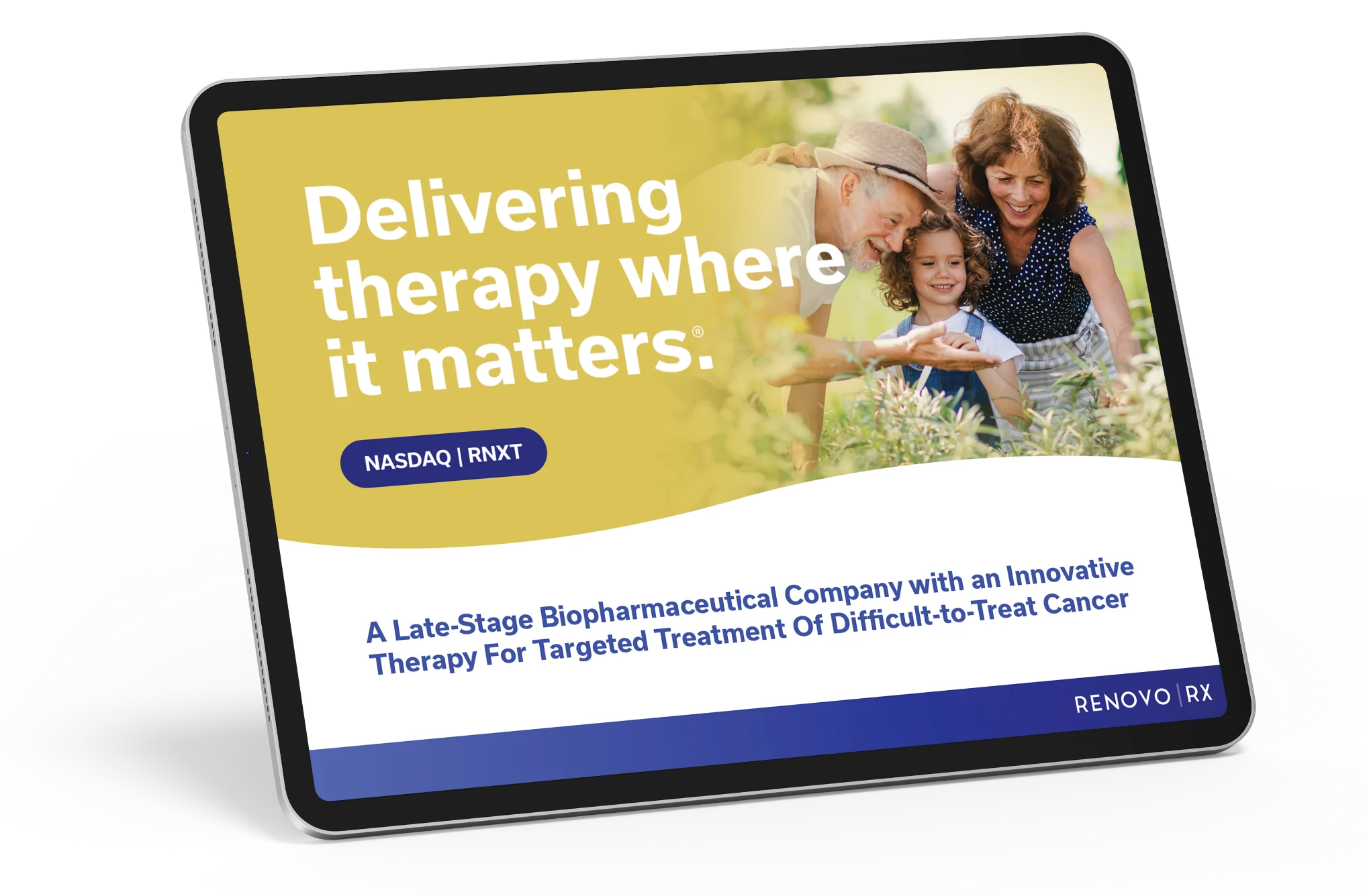
  • The investor deck on a tablet, headlined Delivering therapy where it matters.

    Investor materials

  • From awareness to advocacy

    2.8M average monthly impressions at a $2.08 CPM.

Let's talk.

Open to digital leadership roles and select consulting engagements.