Making a promising cancer therapy feel human
For RenovoRx, a NASDAQ-listed clinical-stage biopharmaceutical company entering Phase 3 trials for a targeted pancreatic cancer therapy. Eight months to turn a cold scientific brand into one families could approach.
01
The decision
Trade the cold language of science for the warmth of family, without losing a word of scientific accuracy.
02
The challenge
RenovoRx had developed a targeted therapy offering real hope for one of the hardest cancers to treat. Almost nobody knew. As a relatively unknown brand entering Phase 3 FDA clinical trials, it needed awareness, trial interest, and investor confidence at once.
The existing identity worked against all three. Cold, clinical, and scientific, it kept the very people it needed at a distance: patients and families in the most vulnerable moment of their lives.
And every word was regulated. A public company marketing around an active clinical trial answers to FDA rules, securities law, and its own review board. Warmth had to be achieved without a single overpromise, in eight months.
Unknown brand · Phase 3 stakes · Every word regulated · Vulnerable audience · Eight-month window
03
The approach
01
Reframe
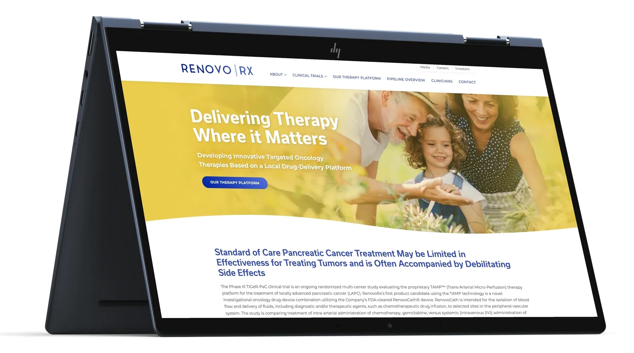
With the executive director, made the case for moving from cold scientific tones to warm, familial ones. Hope became the brand's visual language, anchored by the line about delivering therapy where it matters.
02
Redesign
Consulted on and approved the UX and UI of the new website: warm imagery, plain-language explanation of the therapy, and clear pathways toward trial information and enrollment interest.
03
Clear every word
Managed board review for every single marketing material, keeping campaigns inside FDA and securities boundaries without letting compliance flatten the warmth.
04
The solution




05
Outcomes
2.8M
Average monthly impressions
$2.08
Average CPM
$2.04
Average cost per action
Monthly averages across a six-month period of social media campaigns
A brand that had been cold and unknown became warm, consistent, and visible across its website, social presence, and investor materials, all cleared through review, all in service of getting a promising therapy in front of the people who needed to know it existed.
06
Reflection
The real work was trust. When a brand is someone's life's work, every recommendation can sound like a critique. I learned to educate without taking ownership away: it's their baby, and my job is helping it grow toward their goals. Eight months and a review board taught me more about leading clients than any campaign metric could.
More work
Back to all work