Making a concierge's website act like a concierge
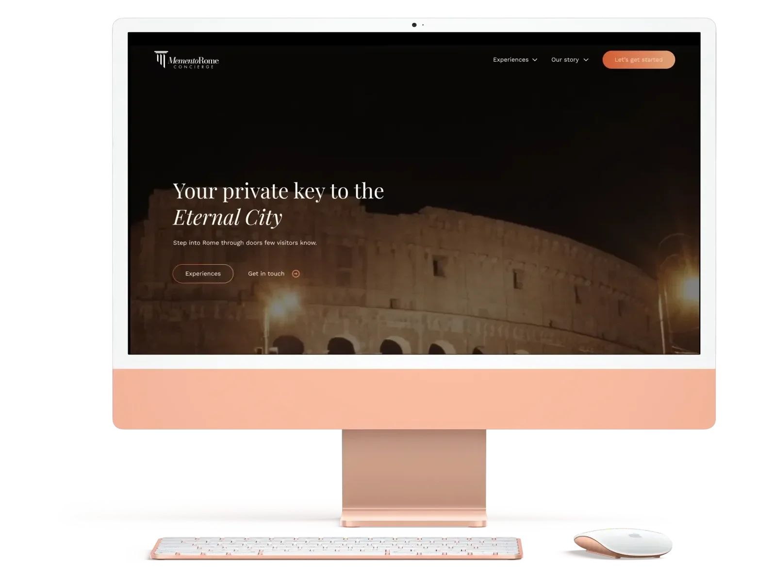
For Memento Rome, a luxury concierge crafting tailored Roman journeys for travelers who would rather live the trip than plan it. An independent engagement, end to end: audit, strategy, copywriting, and design.
01
The decision
Make the website behave like the service: anticipate, guide, remove friction. A concierge that never offers help is just scenery.
02
The challenge
Memento Rome sells trips starting around seven thousand dollars to affluent travelers, and to anyone who simply refuses to spend their vacation planning it. The service was exceptional. The website was beautiful. And the two had almost nothing to do with each other.
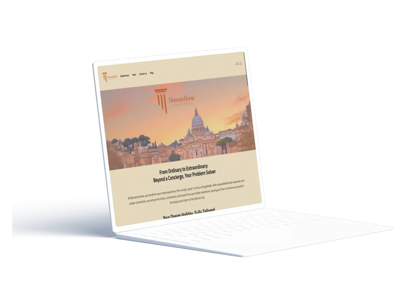
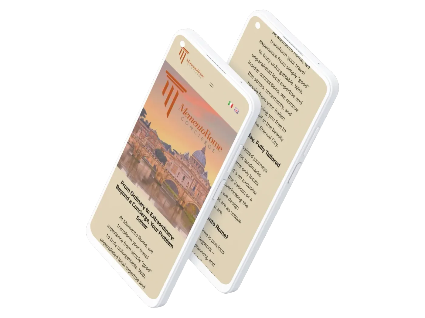
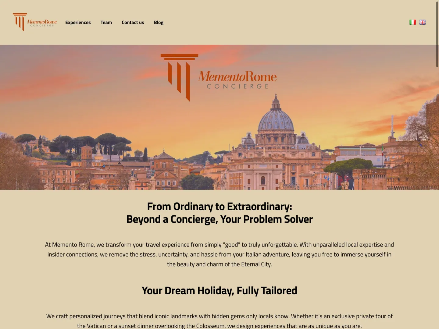
Golden imagery of the Eternal City, elegant type, and then: no call to action above the fold, centered walls of text, one photograph used twice, no trust signals, no way to capture an interested visitor. The site set a mood and then went quiet at every moment a decision could happen.
The client knew exactly who they wanted to reach. They just couldn't translate it digitally. That translation was the engagement.
Luxury positioning · No path to inquire · Text walls · No trust signals · No lead capture
03
The approach
01
Audit
A page-by-page diagnostic of desktop and mobile, pressure-tested against how affluent travelers actually decide, with input from my own network in the space.
02
Strategy and copy
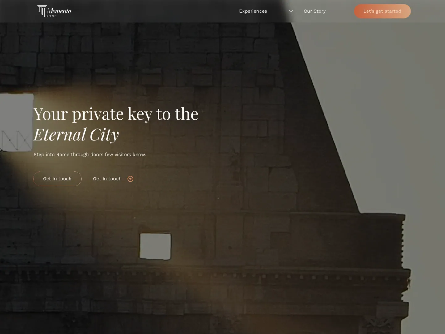
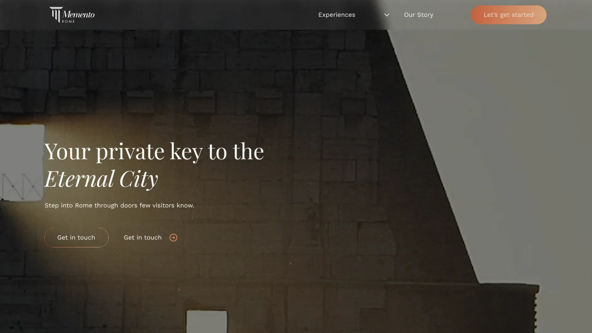
A new voice built on one line: your private key to the Eternal City. A four-step journey, tell us, we design, you arrive, you enjoy, that turns anxiety about planning into the reason to inquire.
03
Design
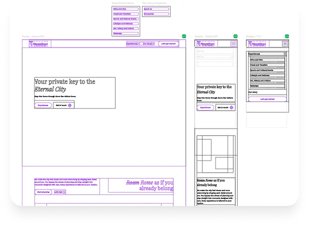
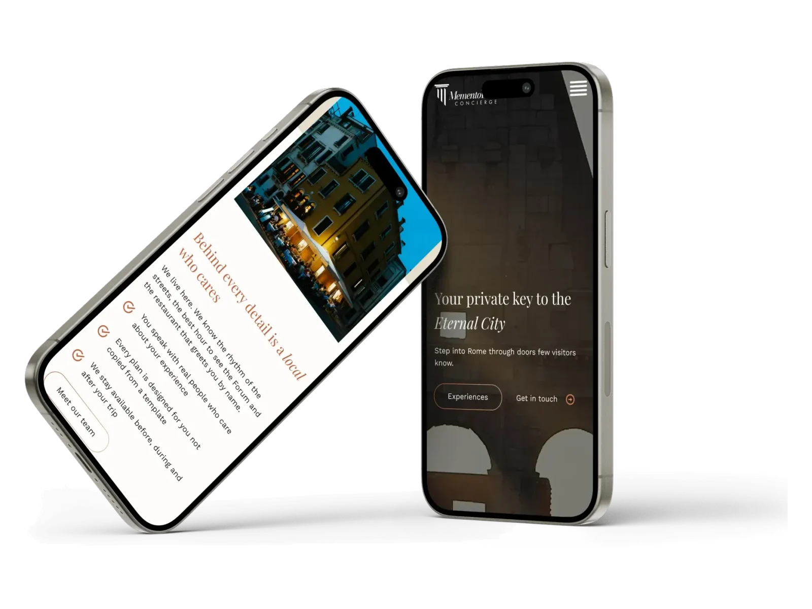
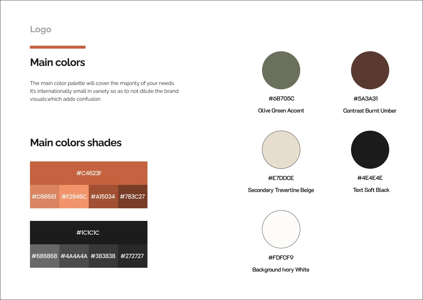
A warm editorial system with a style guide, high fidelity desktop and mobile prototypes, and CTAs placed where decisions happen, handed to the client's developer to build.
04
The solution


05
Outcomes
The redesign is live: new positioning, new copy, a clear journey from curiosity to inquiry, and a design system the brand can grow inside. Performance data stays with the client, and this page will only ever carry numbers they share.
The engagement ended. The relationship didn't: the client still returns for consulting.
06
Reflection
This was the whole discipline in one engagement: audit, strategy, copy, and design, carried end to end alongside the client and the developer who built it. The lesson that stays with me is about luxury and asking. Brands like this fear that a call to action will cheapen them. But a concierge exists to be asked. Once the website started offering help the way the service does, elegance and conversion stopped being a tradeoff.